How can we take so much content and whittle it down to a quick prospect pitch? A good cartoon synthesizes complex stories and ideas into essential images and captions.
This story was originally published in PRINT Magazine.
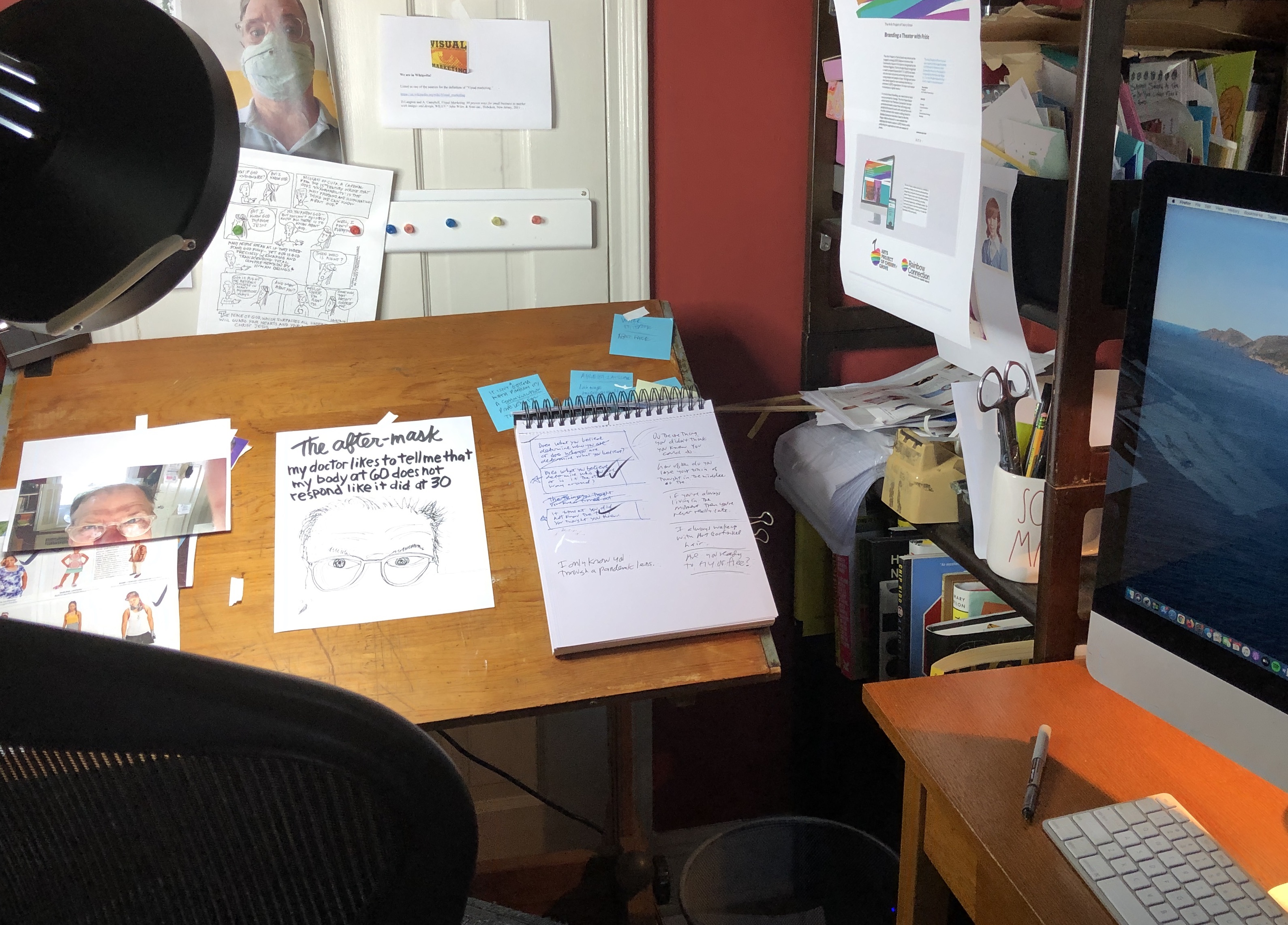
One of the windfalls of the pandemic was that moving my office to my home gave me an opportunity to rediscover my old drawing table. It had been sitting in the basement in a heap for years collecting dust. If I’m going to be stuck working at home at least I could start drawing and cartooning again.
When I was an art student and an intern at a Boston design firm I was struck by how one partner did the design work at his drawing table while the other partner had the office with the couch and the coffee table where he entertained the new clients. I swore I would be the partner with the drawing table. And yet years later, when I was a partner and the Macintosh was changing the role of a graphic designer, I found myself being the partner who entertained clients. The drawing table was disassembled. I had hoped one of my kids would want to use it — neither showed any interest. So, the drawing table moved from apartment to apartment and finally settled into the basement of our house.
Six months into the pandemic, I started to get used to the idea that I wasn’t moving back to the office in the city any time soon—if ever. I began to think about what I wanted in my new home office. There was no need to set up any space to entertain clients—that would be done by Zoom.
Over the years the “office” in my house had become a space for storage. But it was to become a real office: a desk for my Mac, a new printer, a shelving unit, and a few filing cabinets. But I didn’t want it to be just another office. I wanted it to be a place for design and creativity. So, I put together my drawing table. It’s an old oak table that’s small enough to tuck into the corner. I can swing my chair and instantly become an artist again!
I started by going through the work I produced in my twenties when I used to submit batches of cartoons to magazines. I have a stack of rejection letters from The New Yorker and other publications, yet was able to get a few published in trade magazines like Successful Meetings and comics collections like Funny Times and Comic Relief. I started republishing them on Instagram. Then I found my cartoons that were published in the high school newspaper and I put them on Instagram. I started sketching again and publishing a new series of cartoons on weekdays. Having the drawing table out all the time made it easier to do a quick sketch or jot down a new idea. I started keeping a diary of ideas. Even if I didn’t use the drawing table as much as I liked. It still called out to me every day, ready and willing to be part of my life whenever I wanted it to be.
The drawing table began to influence my design work. Sometimes an idea I had for a cartoon would become a headline or concept for my design work. I had jotted down “What do you want to be from now on?” as a cartoon concept and it became the headline of a new blog article. But my drawing table had bigger plans.
At my design firm, we were working on a client project for The Legal Aid Society. We had developed a new vision statement and consumer personas for ideal donors for their LGBTQ+ Unit on Policy and Law. The Unit is a critical resource for over 2000 Legal Aid defense lawyers and an advocate working on behalf of LGTBQ+ people who are incarcerated. We needed to consolidate hundreds of pages of content into a brisk fundraising pitch. How can we take so much content and whittle it down to a quick prospect pitch? The drawing table nudged me. This is a cartoon problem. A good cartoon synthesizes complex stories and ideas into essential images and captions. I swiveled my chair from the desktop to the drawing table. Pulled out my markers and marked up the paperwork with extensive highlighting. Then I mapped out a series of comic strip circles and boxes and started roughing out the high points of the pitch.
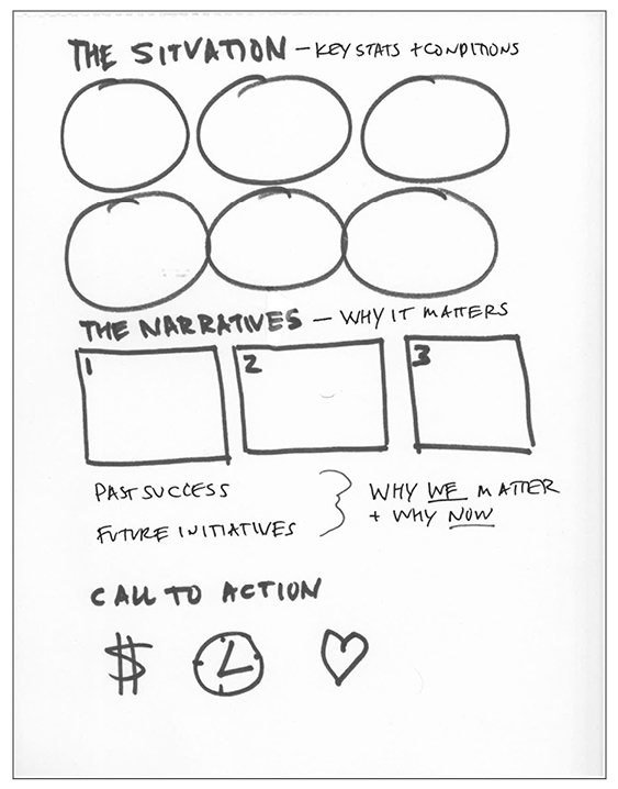
The structure of the pitch.
I incorporated more details. The drawing table encouraged me to sketch out concepts with headlines and captions and even some dialogue that told the story in a quick and effective manner.
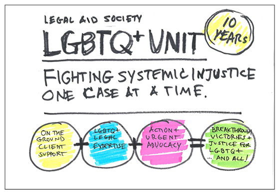
A sketch for the introduction.
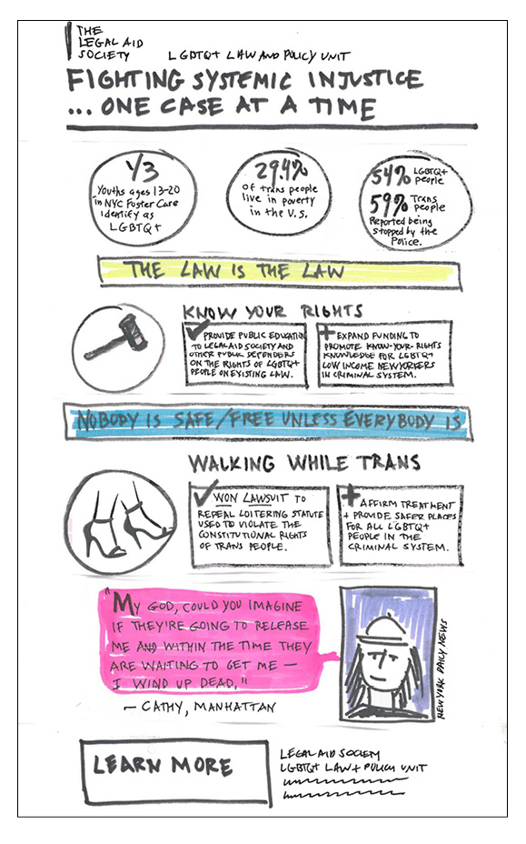
A cartoon version of the infographic.
We presented the concepts to the client for feedback. Do these topics make sense? How do they relate to the vision statement and the customer personas that we developed for the campaign? Erin Harrist, attorney for The Legal Aid Society’s LGBTQ+ Unit said, "It was a very eye-opening experience. We gave the designers so much material and they were able to distill it into content that really resonates with potential funders.”
Once we had confirmed the content was on track, Jim Keller, our design director, and I designed a new promotional tool following the client’s branding standards.
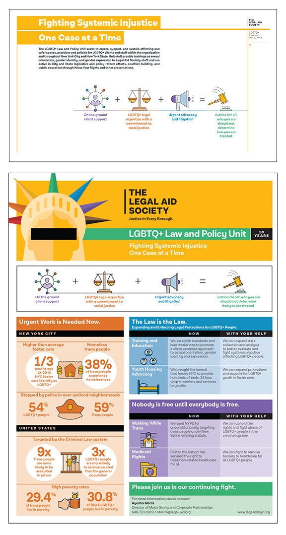
The final communication tools: a PowerPoint presentation template and a promotional infographic.
Why go back to the drawing board?
The other day I was preparing for a new pitch meeting to promote a series of seminars and a dinner gala for a new nonprofit prospect. I wrote out the description of services and made a list of the promotional components that we recommended. But I thought, “this needs to be visual.” I know how to create a master chart in InDesign and map out the campaign so the client can see how everything works together. But we don’t even have the job yet and it’s a lot of work to build the chart properly. The drawing table nudged me again.
“Just draw it out,” it seemed to say. I grabbed my markers and quickly sketched out the campaign. The very act of doing this clarified the campaign and the components for me—and the sketch became the centerpiece of my presentation as I shared my screen on Zoom. The client immediately saw—and understood—the scope of work we were proposing. I sent the written proposal over as a follow-up along with the drawing and closed the deal. We’ve learned adding more drawing to the process invites more discussion and collaboration with the client. The computer tools often make projects look “too final” and discourage the type of dialogue and feedback that sketches encourage. Drawing more has made me feel more creative and has challenged me to push concepts that often get tossed aside on the computer. This process leads to more effective solutions that ultimately save the client time and money because they get what they need sooner. And for me, it’s made being a designer fun again.
To support the work of The Legal Aid Society’s LGBTQ+ Unit on Policy and Law, please click here.
Back to Insights
