Lord + Taylor and Avon recently unveiled new logos that move in opposite directions.
What do they expect to gain from abandoning their brand history? Here’s how to move your brand ahead without ditching your past.
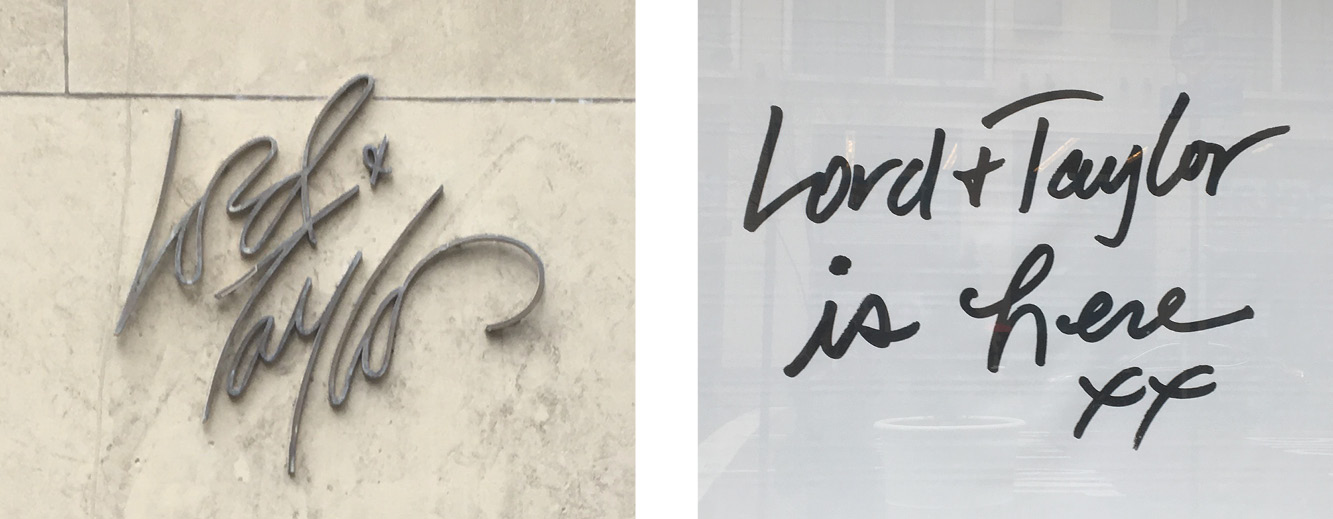
Left: The Lord & Taylor script on the exterior of the now-closed Manhattan store. Right: The sign on the window shade featuring the “Comic san-like” logotype. The new identity will not grace this building’s façade since it is soon to be replaced by WeWork.
Lord + Taylor gets a modern makeover
The hand-drawn script of Lord + Taylor is gone after years of downgrading. The once beautiful and elegant sweep of letterforms with the classic Lord + Taylor script has over the years been reduced to something that resembles Comic Sans. The original was the epitome of elegance. According to design historian and author, Paul Shaw, “One could say there is no such thing as ‘the’ Lord + Taylor logo.” A script logo debuted as early as 1933 by art director Harry Rodman. Shaw writes, “Rodman began encouraging illustrators to incorporate the logo in their drawings for ads, with the result that it was written afresh by each artist.” The full history can be read here.
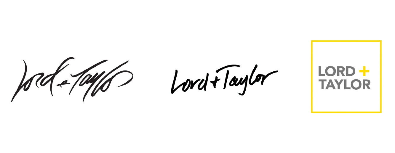
But just as their flagship store in Manhattan closes, their logotype is now being refashioned in a square with a “modern” sanserif font. Lord + Taylor, founded by Samuel Lord and George Washington Taylor in 1826, has been in business longer than any department store in North America. They are now making a break with their past to introduce a new logo that is intended to make them seem more relevant, yet seems more likely to blend into the landscape.
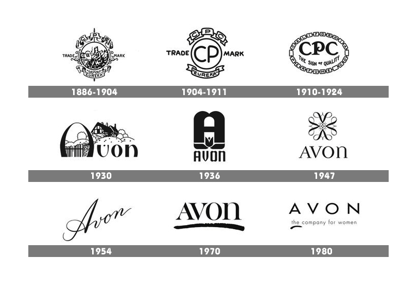
Avon goes retro
As Lord + Taylor struggles to become more modern, Avon goes retro. Avon had a sanserif “modern” logo and is changing their brand to a sock-it-to-me ode to the sixties.
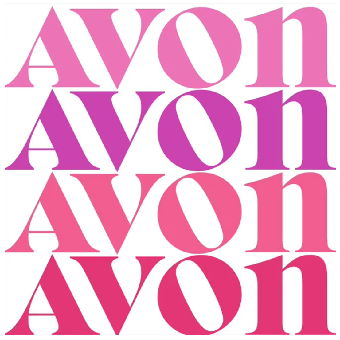
As Avon says in their announcement, “Meet our new logo! She represents fun, confidence & is the sign to go ahead and talk about all the important things — friends, love, life, laughter. She’s inspired by our heritage, but we’re shaking things up and putting a twist on the past...”
That twist? A backwards “O.”
Our assessment
They are both going in the wrong direction.
Lord + Taylor has turned its back on its heritage and loses the elegance and upscale aspect of its branding by replacing it with a modern logo that might have looked fresh in the 80s. It remains to be seen if Lord + Taylor can survive as a department store in the age of Amazon, but if it does it will need to recapture it’s upscale positioning to be truly viable.
Meanwhile, Avon had a clean and modern logo that seem to reflect its online stores and continued relevance as a resource for more than just beauty products. Now it looks like a lipstick company. It is a fun and retro-cool look, but is that what Avon really is? This one does have the advantage of making Avon seem more about beauty and fashion. The question is whether Avon’s product line will match this sensibility.
How should you update your brand?
Starbucks is an obvious example of a brand that continues to evolve while maintaining a link to their origin story. When they rolled out their current logo in 2011 they didn’t consider this a “do-over,” but rather, they purposely described this as the next step in their history. Their announcement stated, “Starting tomorrow customers around the world will begin to see the evolution of Starbucks brand, signaling the company’s continued growth and unique business model.”
When Pentagram redesigned the American Express logo they made technical adjustments to the logotype and introduced a shorter “Amex” version of their famous blue box. Pentagram states in their notes, “The identity preserves and enhances the iconic Blue Box logo, immediately recognizable as American Express.” By embracing their past, Starbucks and American Express were able to move forward with a more contemporary symbol that still paid tribute to their brand heritage.
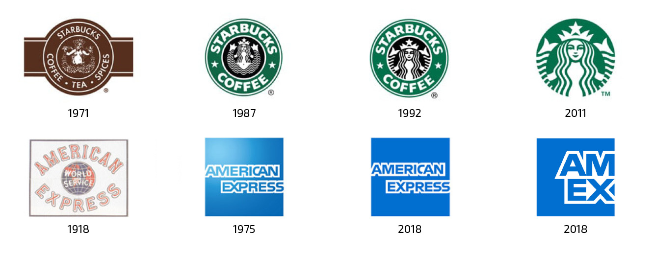
Starbucks and American Express have updated their logos and celebrated their history while simplifying their graphics and moving the brands forward.
Back to Insights
