Online headlines for your website and for use in social media are more descriptive since they are written to be searched. Print headlines are written to entice and tend to be shorter. Writing for digital vs. print audiences is different. Do you want to get the most out of your online headlines?
Every Sunday I settle into a comfy chair and read the New York Times—in print. I snap open my favorite section (The Week in Review) and read and pontificate to my wife who sits across the room doing her Sunday Times reading on her iPhone. We frequently discuss (and argue about) the news and then I’ll go to my phone and try to send her the article I am reading to prove my point. But, the headlines are rarely the same. And in many cases, when I search the headline from the print edition I can’t find the article! (It has become easier to find the article since they’ve started adding the “print headline” in the article description.)
Why are the headlines different? In most cases, online stories are found via search, where print articles are found on the page next to photos and illustrations. Overall the print headlines are more imaginative and poetic while the online headlines are more descriptive and detailed. Online headlines are more likely to include keywords that may show up in searches. Print headlines are more likely to repurpose an Elvis Costello lyric or use a Shakespearean reference. In an article about online headlines The New York Times explains the difference between print and digital writing:
“Editors are afforded more freedom with the digital version of a headline because they’re not constrained by the space available on a given page. “Often we have to boil down a lengthy web head to three lines just a column wide, which can mean just six words,” said Lew Serviss, a senior news editor at The Times.”
What can we learn about online writing vs print writing from examining a few headlines?
I took a look at a few articles from the New York Times on Friday, August 13, 2021, to make a few observations. The Weekend Arts section has this headline, “Do Classical Paintings Get a Pass?” I had to search for “Titian Exhibition” to find the online story because the online title is “Can We Ever Look at Titian’s Paintings the Same Way Again?” The print edition features a shorter and open-ended question. You have to look at the large photo of the painting and read the subtitle (“Looking at a Titian exhibition, and questioning whether historic works can be considered exempt from modern moral scrutiny”) to find out that this is an article about Titian paintings and that author is examining the works from a modern perspective. Yet online, you get the artist’s name in the title and a long subtitle (“Great is what this art is, yet it raises doubts about whether any art, however “great,” can be considered exempt from moral scrutiny.”) The subtitle is written in a casual way yet it carefully establishes that the critic thinks this is great art and that all great art may be subject to modern scrutiny. It seems to be preempting an argument from someone who might be thinking, “There they go again, trashing the classics.” This online headline is more descriptive, more casual, and more aware of the potential viral backlash.
Another story in the arts section about the Aretha Franklin bio-pic provided an interesting contrast. In print, the headline is, “A Polite Portrait of a Spirit in the Dark,” accompanied by a photo of Jennifer Hudson as the queen of soul. The online headline is, “‘Respect’ Review: Giving a Queen Her Propers,” which includes the title of the classic song (a searchable name) and labels the article as a “Review.” In the print edition, the location of the story in the Arts section along with the standard movie name/credits box indicates to the reader that this is a review. But when this story is picked up on Facebook, the reader needs more context. Print articles have a page layout and positioning that helps you find content. Online layouts are always changing, they can be a single column on your phone, or in multiple columns on a wider computer screen, or orphaned in a Facebook or Twitter feed. Online readers don’t have the same conventions to help them figure out what an article is about.
Jill Taylor, Assistant Standards Editor at the New York Times, stated in the same article, “In a competitive news environment, there’s value in changing a headline when the story changes because it keeps you up in search.” The Times also uses A/B testing to try out alternate headlines in the online version. They’ll post different headlines when an article is first published, gauge the reaction, then use the most effective headline online. They publish the stories online first, then go back and rewrite the headlines for the print edition.
Print headlines tease the reader while online headlines define content
Does this apply to articles outside the Arts section? Let’s look at the Business pages. The lead story in print is “Chasing a Breakthrough in Fusion,” with a large photo of a physicist surrounded by equipment. A photo caption with a subtitle provides many more clues. Headlines in print tend to tease, where headlines online tend to describe. People online don’t have time to be teased in the same manner, they are not settled in with a cup of coffee, getting ready to read the morning paper. They are glancing at the feed, watching video clips, and moving about — it’s called mobile after all! For digital platforms, you need to be aware that you are writing for a distracted audience. The online headline, “Massachusetts Start-Up Hopes to Move a Step Closer to Commercial Fusion,” is a much more descriptive headline that does a much better job informing the reader what the story is about.
What does it mean to be “Top of the Fold”?
The “top of the fold” refers to what you can see on the newspaper—before you unfold it. This tradition of using the top real estate to showcase the most important story of the day gives the editors in a newspaper a lot of power as they are defining what they think is the “lead story” for the day and presumably for the record. That’s why Page One headlines in print tend to be authoritative, and very short— since they often have to squeeze into double or even single columns. For web pages, we refer to “top of the page” as the area you can see without scrolling. The same type of restrictions does not apply online because there’s no fixed front page. The top stories change all the time. No one made a choice to pick the definitive top story of the day because it’s always being updated and minutes later another story will take the top spot. Digital platforms promote their stories via news alerts and social media shares.
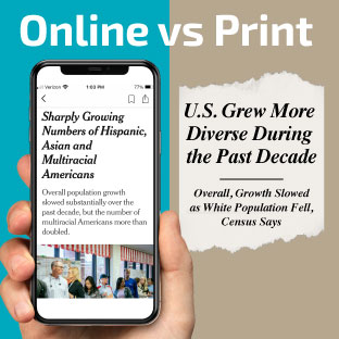
Page One in Friday’s New York Times, the print edition included, “U.S. Grew More Diverse During the Past Decade,” while the online headline, “Census Shows Sharply Growing Numbers of Hispanic, Asian and Multiracial Americans,” is much more informative! This is a really good example of how the online version describes what the article is about for a digital audience.
Writing for the web
Most of our writing is now online. We write most often for emails, social media, blogs, and on websites, yet we still tend to write like we are being published in print. To write better headlines you need to consider how your audience reads online. Think about how headlines are used in search, keep them friendly and descriptive. And remember, online headlines can be updated and changed as needed. Take advantage of the flexibility of digital platforms. Experiment with alternate headlines, see how your audience reacts, and don’t be afraid to make changes because not only can you make changes, you are expected to.
Back to Insights


