The Ghostbusters are back and so is the ubiquitous Ghostbuster’s logo. But beware, the logo is presented in two scenes that send chills up the spines of logo designers.
 The Ghostbusters’s logo is one of the few movie logos used on screen and in promotion (the other being Chip Kidd’s logo for Jurassic Park.) So it comes as a shock that the logo is presented in two scenes that should send chills up the spines of logo designers.
Scary Scene #1: Kevin’s Interview
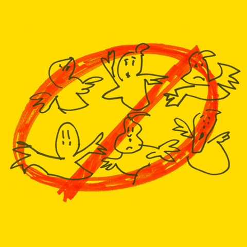
Kevin (Thor’s Chris Helmsworth) is being interviewed for the receptionist position and is asked to share his logo designs with the Ghostbuster team. It's bad enough when the logo designer is equated with the receptionist job. And this isn’t just an ordinary logo. According to Adweek the Ghostbusters logo designed by Michael C. Gross enjoys a 96% recognition rate among consumers 13-54—two generations after the initial release of the first movie. The first thing we tell students of graphic design: "do not work on spec!“ You should get paid before you show any new design work. This is very scary for designers.
Scary Scene #2: The Graffiti Artist
After rejecting the logos from their receptionist, the Ghostbusters investigate a paranormal appearance in the subway and stumble upon graffiti artist (Nate Corddry) who perfectly renders the classic Ghostbusters logo on the subway wall in spray paint. This is probably the best special effects in the movie. He is not even looking at the wall while he paints. It's impossible to draw that logo so perfectly in spray paint in one fell swoop. This raises the bar for all logo renderings creating a very scary new standard for designers everywhere. To make matters worse, Ghostbuster Kate McKinnon snaps a photo of the artwork and says this would make a great logo. No designers are being paid in the making of this logo.


