The role of art direction and writing in creating effective communication.
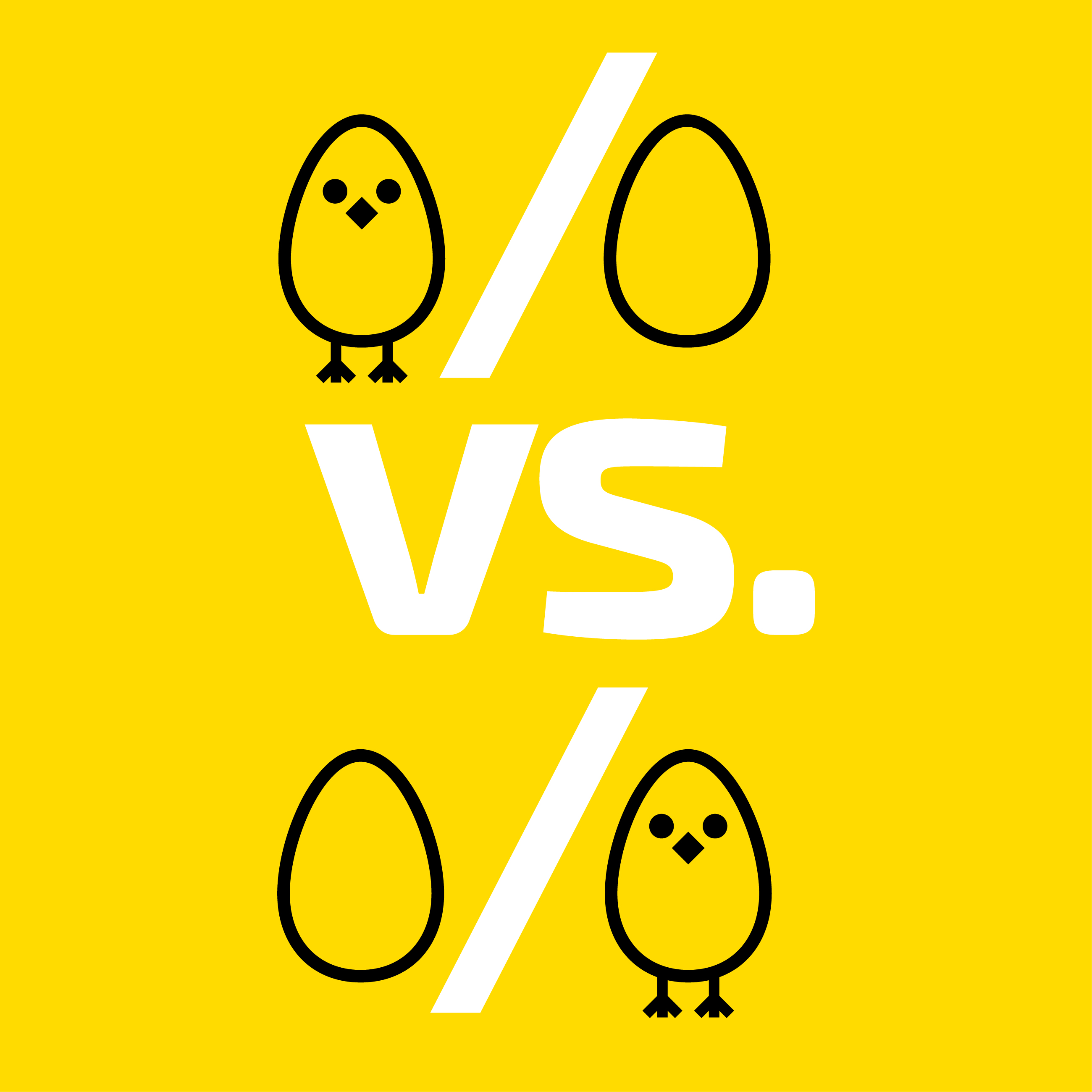
When writing music some collaborators write the music first then add lyrics, others write the lyrics, then write the music. When Richard Rodgers of Rodgers and Hart worked with lyricist Lorenze Hart on classics like “Isn’t it Romantic” he always wrote the music first and, yet when he formed Rodgers and Hammerstein and wrote “The Sound of Music,” Oscar Hammerstein always provided the lyrics first. The New Yorker magazine’s popular “Caption Contest” asks readers to look at the picture and write a caption. As a cartoonist, I can never get this to work. I realized that that when I create a cartoon, it’s concept – or words first –then I do a drawing. So, seeing the picture first really trips me up.
When it comes to publishing articles with words and illustrations we rarely hear of “image” first situations. Wouldn’t it be interesting if the artwork came first and the writer was told to write the article to accompany the artwork? That would be art direction heaven! The only time the imagery comes first is when writing captions for photos. Otherwise, it’s content first. An editor will assign a topic to the writer and then the art director will commission the artwork based on the topic.
What if writers pick their own artwork?
Many writers think they should pick out the artwork for their articles. And yet the roles of writers and art directors are pretty distinctive. There is an inherent conflict in writing and art direction. Why is that? It comes as no surprise that many writers tend to be more concerned with the topic and prefer artwork that accurately reflects the written word. This can lead to artwork that is “on topic” thematically, but doesn’t necessarily add to the delivery of the content to the reader. As an art director I am often instructed to follow the writer’s lead and get imagery that reflects specific topics in the essay itself. This literal interpretation may be good for writers but it does not address the overall needs of the readers and can lead to a boring repetition of the words on the page. Writers tend to focus on “Meaning” whereas art directors are looking at “Form and Meaning.”
Form and Meaning…and Function.
Ultimately, the artwork must be more than just related to the story – it must convey meaning and relate to the story theme. Does it convey the right time period (is the story contemporary, or retrospective) What’s the right attitude or hook to pull in a reader (does it relate to a certain demographic. Younger readers, older readers, both)? Does it convey a political message or viewpoint?
Ultimately, it’s about how you, “marry the image with content to tell a cohesive story,” says writer John Fatteross. The imagery must draw readers in. It’s successful when the artwork compels the reader to actually read the article. There’s a reason “director” is in the title of Art Director. A good AD is focused on how the form supports the meaning and how that successful marriage of words and image connects to the reader.
Collaboration is also key
Whether the words or the images came first is not the point, it’s how they work together that really matters. One really affects the other. According to Lynne Hutchinson writing in Performing Songwriters, “Lorenze Hart would get to work writing the lyrics, but always with Rodgers in the room, playing the piano for him, trying out various versions as the verses began to form.” There’s more collaboration as the writer and composer adjust their work in reaction to each other. Writer Debby Coughlan adds, “It is extremely helpful when I have the opportunity to edit my written content – one more time – AFTER it is positioned with the imagery…Sometimes it's just a matter of changing one word but it can make all the difference. This is because the words and imagery inspire each other in a somewhat fluid way.”
Back to Insights


