
How do you capture the energy of tech stocks while encouraging long-term investing? The Internet Fund — the first mutual fund dedicated to technology investments—needed to quickly establish a strong visual identity reflecting its unusual, value-driven technology strategy.
The new logo design resembles an information sign on the highway, giving potential clients a clear signal that the company is forward thinking and willing to share its investment knowledge.

The diamond-shaped logo is the lynchpin for a family of fund identities.

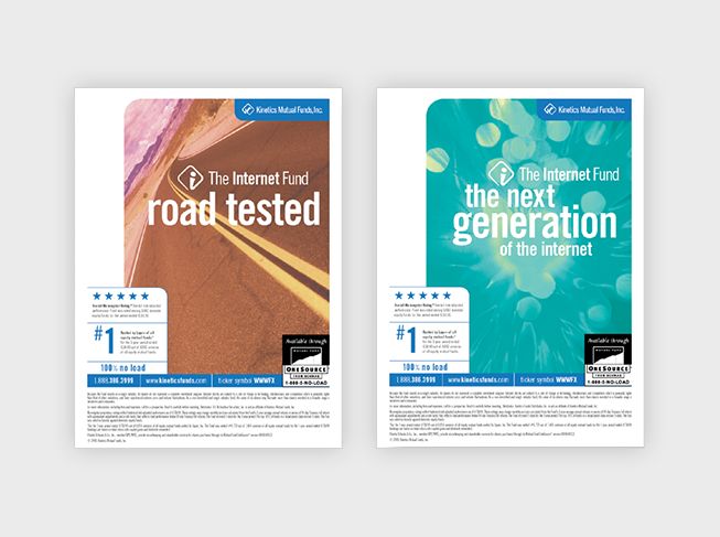
The marketing campaign features a series of ads in The Wall Street Journal, Money magazine and other financial publications.
David Langton is the founder of Langton Creative Group, an award-winning NY communications design. He is available for strategic brand design and consultation while pursuing college teaching and speaking opportunities.