The Rumpelstiltskin of Designers

When Norman Cherubino and I started our design firm in 1995, Norman told me that he wanted to create a firm that was big enough and good enough to hire a designer like Jim Keller. Four years later, Jim Keller was in between jobs, and we offered him a desktop in our studio to use until he found a full-time job. Jim worked with us for the next 25 years. Jim was the most creative and thoughtful designer I have ever known. You could give him straw, and he would make gold. He was the Rumpelstiltskin of designers. Jim would always produce more concepts and variations than anyone else. A peak into Jim’s sketchbook reveals the wide range of ideas that were bouncing around in his head.
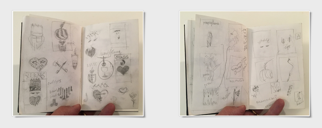
Jim’s sketches for Arizona State University theater and opera poster series.
Jim never stopped sketching and thinking; the two things were tightly entwined in his approach. He always wanted to know everything there was to know about an assignment. And wouldn’t start until he had all the necessary ingredients. Where was the artwork being used? What size—every possible size—would the artwork be used in? Who was the audience? Why does this matter? Because everything mattered to Jim. We would often ask him to resize a standard postcard to a first-class postcard, and he would sigh and say, “That's going to take a while.” The rest of us would just enlarge the artwork and call it a day—but Jim had a secret formula of size, relationship, proportion, and his own golden ratio. He thought of every detail when he designed. Changing the headline could throw him off. He was the practitioner who delivered on Dieter Ram’s principle, “Good design is as little design as possible.”
Jim was the third boy in a family of six. He graduated from the University of Cincinnati and did his internship in NYC. Then, he began his career as a New York designer. As Rick Whelan recalls, “Jim worked for me at The Whelan Design Office and was one of the best designers I've worked with. I admired his keen sense of typography and appreciation for white space.”

Above are three logos from the Whelan Design Office that are examples of Jim’s earliest professional work. Rick Whelan said, “The Freddie Mac may not look exciting, but it solved the requirement of including the communicative and legal names. That's a lot of words!”
After that, Jim spent many years as the senior designer at Carla Hall Design, where he created communications for Morgan Stanley, among others. Carla Hall said, "Jim certainly was one-of-a-kind; irreplaceable and indefatigable. Every day he inspired me with his imagination and clear thinking. There wasn’t a day I did not learn something new or think ‘out-of-the-box’ ideas because of Jim. He was truly the heart and soul of my studio for well over a decade." His work was honored with over 100 design awards including AIGA, Print, Graphic Design USA, Communicator, Apex, and the International Golden Quill for Strategic Communications, IABC.
Jim was always impeccably dressed in vintage bowling shirts. He often looked like he just stepped out of his favorite tv show, The Dick Van Dyke Show. Jim knew every episode by heart. Whenever he made coffee he would recount the Long Night's Journey Into Day episode where Laura and Millie are home at night alone and afraid of every bump in the night.
Millie: What are you doing?
Laura: I’m making the coffee.
Millie: OK. (He would say this in a scared, high-pitched voice—just like Millie would.)
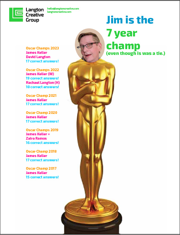
Jim was also an expert on the movies—he knew everything on Turner Classics. You could just say “Barbara Stanwyck and Fred MacMurray” and he would not only know Double Indemnity, but he would tell you about the other movie they made together, Remember the Night and say, “That’s the one where they’re on a road trip and they spend the night in a pasture milking a cow.” Every year Jim would win the office Oscar Contest. He never watched the movies – until years later, when the better ones, would end up on Turner Classics! He would do research and figure out who would win all the minor categories like “Live Action Short” and rack up 15 or more correct answers.
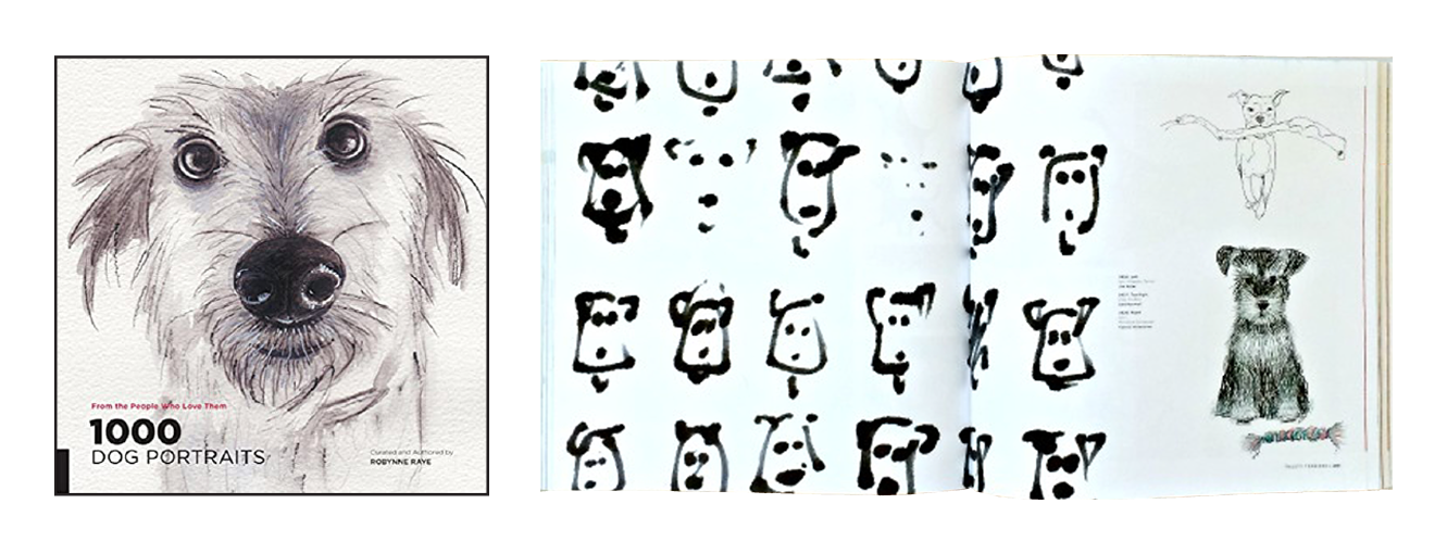
One of Jim’s favorite projects was the Lani dog shampoo branding. He drew hundreds of dogs until he got just the right look. Then, he designed a unique brand guidebook that captured the whimsy of the product.

The Lani sketches are featured in 1000 Dog Portraits by Robynne Raye (Rockport) a compilation of quirky, fun, fanatical illustrations, paintings, collages and drawings from designers and artists around the globe.
Many years ago we had a business coach who ran an offsite workshop with our design firm. We were each given titles that reflected who we were. Jim was named “The Judge.” We all turned to Jim for the final ruling on whether a design was good enough. We wanted his blessing. An “attaboy” from Jim was the gold standard. Every semester I tell my students how good design is based on refinement and refinement is based on good feedback. Yet it’s intimidating to ask for feedback. Even after 25 years of working together I would have to work up the confidence to show my work to Jim and still wanted to get that “attaboy.” But it was always worth it. He’d show you what was missing and ask you if you had tried this approach or considered these elements. The design was always better.
Jim was always my best editor. He would take out all the ellipses, fix the odd habit I have of Capitalizing too many words, and replace my tangled idioms with succinct phrases. I would love to see what he would have done to this essay. Jim has forever changed me as a designer and made me a better person with too many insights and advice to include in this tribute. His work has been featured in projects for large organizations like Pfizer, Deloitte, JDRF, International Rescue Committee, and Children’s Aid and for personal favorites like the Arts Project of Cherry Grove, tease bubble tea, and elmo. Jim loved to work on design projects. I envision him licking the end of his number 2 pencil as he sketches out his next project—those pearly gates probably need a makeover.
If you would share like to share any condolences or memories of Jim, please email us, and we'll share them with his family.


