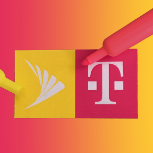
Color plays an important role in defining a brand. What does color mean for your brand?
Investors, consumers and the Department of Justice may be more interested in fair competition, the scale of the merger and the breadth of their 5G network, yet for brand managers and designers, it’s all about color.
The role of color in a brand
Both companies use color very boldly. T-Mobile’s bright pink is the outlier in an industry of staid colors. Sprint stole the Verizon spokesman and made him wear a brilliant yellow baseball cap. In contrast, their much larger competitors, Verizon uses bright red while AT&T clings to corporate blue. Selecting a color that you can own in your industry is an effective way to gain a leg up on the competition. When everyone looks one way, you can use color to be distinctly different. You may also choose a color that has brand associations with it. But be careful, colors have many meanings. Green, for example, may mean you’re environmentally aware, or that you want or make a lot of money, or that you’re envious.
Can you have too many colors?
It used to be that your logo had to work in black and white and that color was a nice additive, but in a world of digital communications, there are no the limits to the amount of color you can use. Most brands will stick with one or two colors. Coke has red, while Pepsi uses red and blue. A unique combination of two colors works well for FedEx. But beware of too many colors. Hannah Gadsby complains in her new Netflix comedy special that the “Rainbow” flag for the LGBTQ movement has too many colors, “six very shouty, assertive colors stacked on top of each other.”
T-Mobile actually owns the color pink (or magenta)
Some companies, like T-Mobile, have invested in their color and will fight to retain the right to use that color in their industry. A US federal court has granted T-Mobile the right to its own shade of magenta, reported Time magazine in 2014. Why did T-Mobile choose pink? They didn't actually choose it, it is from their parent company Deutsche Telekom. According to the T-Mobile website, Deutsche Telekom or ‘T’ was actually owned by the German Government as Deutsche Bundespost Telekom before being "privatized" in the 90's. Within two years of its introduction, the pink ‘T’ was recognized by nine out of ten Germans as Telekom's logo. “The Magenta T” is easily recognized as the symbol for T-Mobile. It stands out both because it is a single letter ‘word’ and an unexpected color in the crowded cellular communications marketplace,” says Kate Smith of Sensational Color.
The Sprint Yellow
Yellow shines with optimism, enlightenment, and happiness. Shades of golden yellow carry the promise of a positive future. Yellow will advance from surrounding colors and instill optimism and energy, as well as spark creative thoughts. Kate Smith of Sensational Color writes, “Sprint has claimed yellow as the color they think will allow their brand to stand out in the crowded telecommunications space and they are working hard so that when you think “yellow” you think “Sprint.”
How about an orange sorbet?
Wouldn’t it be great if the combined companies simply blended their colors for a cool orangey sorbet? That’s an unlikely outcome considering the dominance of T-Mobile in the merger and the importance the company has put on owning T-Mobile pink. As much as we like sorbet, we would advise T-Mobile to drop the Sprint name and brand and market everything under the T-Mobile brand. That’s what Cingular did when it bought AT&T. The stronger company assumed the stronger brand.
Does anyone want to buy Yellow?
Back to Insights


